L'iPhone qui se déplie
Un écran qui change de taille pendant qu'on lit, c'est nouveau. Une application peut l'ignorer : elle s'étirera, et ce sera laid. Elle peut aussi s'en servir — et c'est ce qu'on a cherché à faire.
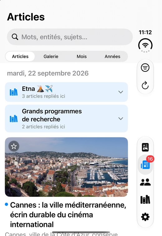
Plié, fornews.ai est un téléphone ordinaire : la liste, puis l'article. Déplié, la liste et l'article se tiennent côte à côte, la carte de l'actualité s'ouvre en grand, et la lecture immersive occupe toute la page. Entre les deux, rien à faire — et surtout, rien à perdre : un article ouvert le reste quand on replie l'appareil.
Plié : un téléphone, simplement
Sur l'écran extérieur, l'application ne cherche pas à en faire trop. Ce qui change vient du système : il pose les barres verticalement le long du bord, là où le pouce les trouve.

Déplié : deux volets, et de la place pour respirer
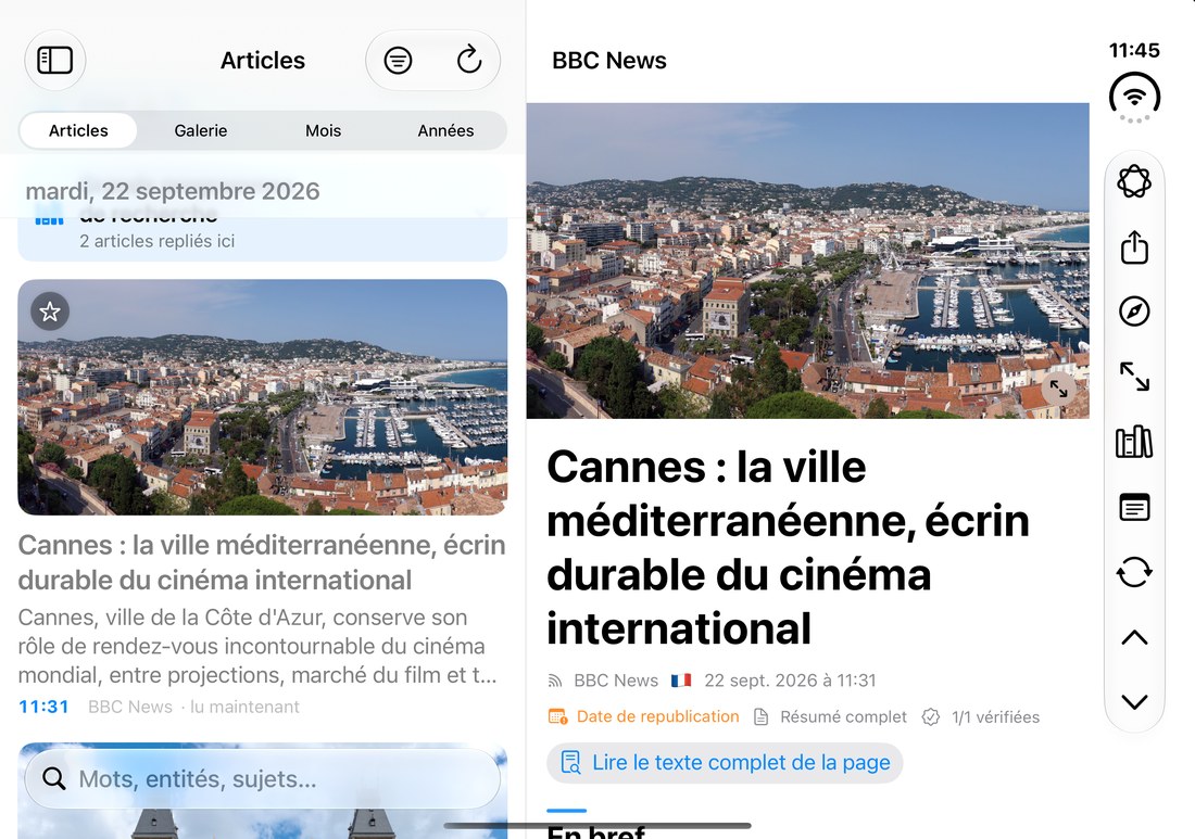
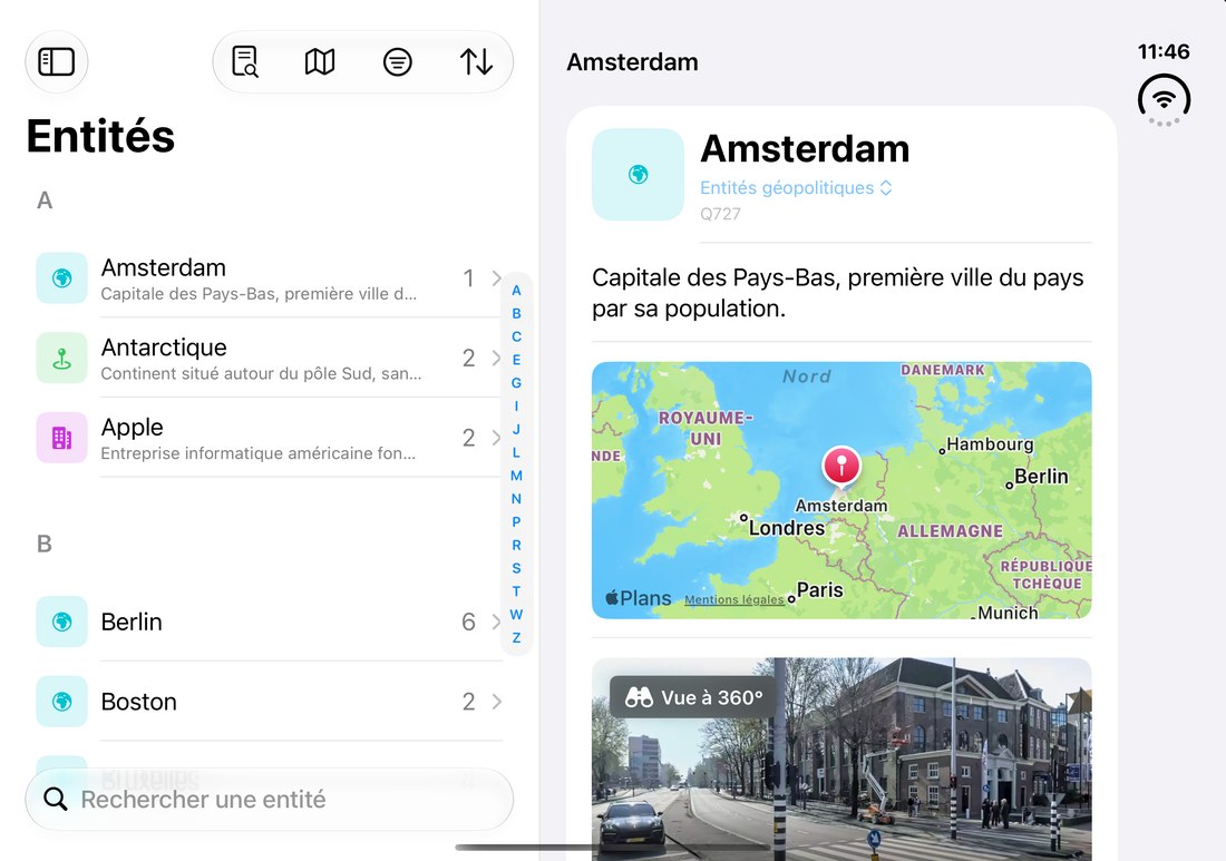
L'écran intérieur fait 867 points de large — la largeur d'une petite tablette. La liste passe à gauche, l'article à droite, et les outils de lecture se rangent verticalement sur le bord.


Quatre postures, quatre moments
Un pliable ne se tient pas d'une seule façon. Voilà comment fornews.ai s'y range.
Dans le métro
Debout, une main, l'autre sur la barre. L'écran extérieur suffit : on descend la liste du pouce, on ouvre un article, on le lit jusqu'à sa station. Les boutons sont posés le long du bord, là où le pouce tombe.
Au bureau
Posé à côté du clavier, l'appareil devient un second écran d'actualité. La liste à gauche, l'article à droite : on parcourt d'un côté sans perdre ce qu'on lit de l'autre. C'est aussi là que la carte de l'actualité prend tout son sens.
Sur un coin de table
À demi replié, debout tout seul, l'appareil n'a plus besoin d'être tenu. La lecture immersive défile — une photo pleine page, un titre, puis la suivante. Un cadre qui raconte la journée pendant qu'on fait autre chose.
Le soir, dans le canapé
Tenu à deux mains comme un petit livre. On lit un article en entier, on touche une entité pour ouvrir sa fiche, on revient. Replier l'appareil ne referme rien : l'article reste ouvert sur l'écran extérieur.
Ce qu'on a appris en chemin
La leçon tient en une phrase : une application doit regarder la forme de l'écran, pas le nom de l'appareil.
Déplié, l'iPhone Duo reste un « iPhone » aux yeux du système. Une application qui décide de sa mise en page d'après cette identité lui servira donc une disposition de téléphone sur un écran de tablette. Mais si elle demande plutôt quelle place ai-je ?, tout tombe juste — et la même question sert aussi bien l'iPad.
| Appareil et position | Largeur | Hauteur | Ce qu'il faut afficher |
|---|---|---|---|
| iPhone, portrait | compacte | régulière | une colonne |
| iPhone « Max », paysage | régulière | compacte | une colonne |
| iPhone Duo, plié | compacte | régulière | une colonne |
| iPhone Duo, déplié | régulière | régulière | deux volets |
| iPad | régulière | régulière | deux volets |
Un détail qui compte : un iPhone tourné en paysage est large, mais bas. C'est cette hauteur qui le distingue d'un appareil déplié — et qui évite de lui infliger une mise en page faite pour une tablette.
Ce qui reste à faire
Honnêtement : la charnière. Le système sait dire où passe la pliure, et une application soigneuse doit éviter d'y poser du texte à lire. Aujourd'hui, la carte de texte de la lecture immersive la traverse encore. On y travaille.
Restent aussi la mémoire de ce qu'on faisait quand l'écran change — une recherche à moitié tapée, la position dans une longue liste —, et les réglages fins de lecture sur un écran plus large.
The iPhone that unfolds
A screen that changes size while you're reading is a new thing. An app can ignore it — it will stretch, and it will look poor. Or it can make something of it. That's what we went after.
Folded, fornews.ai is an ordinary phone: the list, then the article. Unfolded, list and article sit side by side, the news map opens up, and the immersive reader fills the page. Nothing to do in between — and, more importantly, nothing to lose: an open article stays open when you fold the device.
Folded: simply a phone
On the outer screen the app doesn't try to be clever. What changes comes from the system: it lays the bars out vertically along the edge, where your thumb finds them.
Unfolded: two panes, and room to breathe
The inner screen is 867 points wide — small-tablet territory. The list moves left, the article right, and the reading tools stack vertically along the edge.
Four postures, four moments
A foldable isn't held one single way. Here's how fornews.ai fits each of them.
On the train
Standing, one hand on the rail. The outer screen is enough: thumb down the list, open an article, read it to your stop. The buttons sit along the edge, right where your thumb lands.
At your desk
Set down beside the keyboard, it becomes a second news screen. List on the left, article on the right: browse one side without losing what you're reading on the other. This is where the news map earns its place.
On the corner of a table
Half-folded, standing on its own, no hand needed. The immersive reader moves through the day — a full-page photo, a headline, then the next. A frame that tells the news while you do something else.
Evening, on the sofa
Held in two hands like a small book. Read a whole article, tap an entity to open its page, come back. Folding it shuts nothing: the article stays open on the outer screen.
What we learned along the way
It comes down to one sentence: an app should look at the shape of the screen, not the name of the device.
Unfolded, an iPhone Duo is still a "phone" as far as the system is concerned. An app that decides its layout from that identity will serve a phone layout on a tablet-sized screen. Ask instead how much room do I have? and everything falls into place — and the same question serves the iPad just as well.
| Device and position | Width | Height | What to show |
|---|---|---|---|
| iPhone, portrait | compact | regular | one column |
| iPhone "Max", landscape | regular | compact | one column |
| iPhone Duo, folded | compact | regular | one column |
| iPhone Duo, unfolded | regular | regular | two panes |
| iPad | regular | regular | two panes |
One detail matters: an iPhone turned landscape is wide, but short. That height is what tells it apart from an unfolded device — and what spares it a layout built for a tablet.
What's left
Honestly: the hinge. The system can say where the fold runs, and a careful app should keep readable text away from it. Today the immersive reader's text card still walks right across it. We're working on that.
Also left: remembering what you were doing when the screen changes — a half-typed search, your place in a long list — and the finer reading settings on a wider screen.